I recently ran across Dudley Storey’s blog, and it is a treasure trove of HTML, CSS and SVG goodness. My find was his post on SVG responsive maps, which is a pretty slick trick!
Tag Archives: CSS3
CSS3 animation for Bootstrap icons
I found this great post on Elijah Manor’s blog where he animated the refresh icon. I don’t use Bootstrap on my site, but I did have the need for a refresh icon for an older post, and this would have been pretty cool. If only I had been smart enough to think of it. DOH!
If you want to skip all the specifics and just get to the payoff, here is the jsfiddle with the working animation:
Horizontal Rule using CSS3 Gradient
I love all the little tricks you can perform with CSS 3. I saw this nice horizontal rule on MLSsoccer.com:
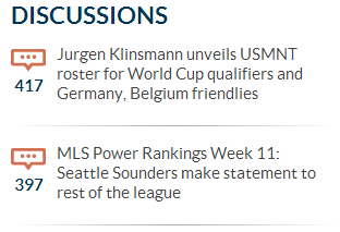
The CSS is pretty simple:
hr {
	background: #ababab;
	background: url(data:image/svg+xml;base64,PD94bWwgdmVyc2lvbj0iMS4wIiA/
		Pgo8c3ZnIHhtbG5zPSJodHRwOi8vd3d3LnczLm9yZy8yMDAwL3N2ZyIgd2lkdGg9Ij
		EwMCUiIGhlaWdodD0iMTAwJSIgdmlld0JveD0iMCAwIDEgMSIgcHJlc2VydmVBc3Bl
		Y3RSYXRpbz0ibm9uZSI+CiAgPGxpbmVhckdyYWRpZW50IGlkPSJncmFkLXVjZ2ctZ2
		VuZXJhdGVkIiBncmFkaWVudFVuaXRzPSJ1c2VyU3BhY2VPblVzZSIgeDE9IjAlIiB5
		MT0iMCUiIHgyPSIxMDAlIiB5Mj0iMCUiPgogICAgPHN0b3Agb2Zmc2V0PSIwJSIgc3
		RvcC1jb2xvcj0iI2ZmZmZmZiIgc3RvcC1vcGFjaXR5PSIxIi8+CiAgICA8c3RvcCBv
		ZmZzZXQ9IjUwJSIgc3RvcC1jb2xvcj0iI2FiYWJhYiIgc3RvcC1vcGFjaXR5PSIxIi
		8+CiAgICA8c3RvcCBvZmZzZXQ9IjEwMCUiIHN0b3AtY29sb3I9IiNmZmZmZmYiIHN0
		b3Atb3BhY2l0eT0iMSIvPgogIDwvbGluZWFyR3JhZGllbnQ+CiAgPHJlY3QgeD0iMC
		IgeT0iMCIgd2lkdGg9IjEiIGhlaWdodD0iMSIgZmlsbD0idXJsKCNncmFkLXVjZ2ct
		Z2VuZXJhdGVkKSIgLz4KPC9zdmc+);
	background: -moz-linear-gradient(left,#ffffff 0%,#ababab 50%,#ffffff 100%);
	background: -webkit-gradient(linear,left top,right top,
		color-stop(0%,#ffffff),color-stop(50%,#ababab),color-stop(100%,#ffffff));
	background: -webkit-linear-gradient(left,#ffffff 0%,#ababab 50%,#ffffff 100%);
	background: -o-linear-gradient(left,#ffffff 0%,#ababab 50%,#ffffff 100%);
	background: -ms-linear-gradient(left,#ffffff 0%,#ababab 50%,#ffffff 100%);
	background: linear-gradient(to right,#ffffff 0%,#ababab 50%,#ffffff 100%);
	filter: progid:DXImageTransform.Microsoft.gradient(
		startColorstr='#ffffff',endColorstr='#ffffff',GradientType=1);
	margin: 20px 0;
}
You can just swap the #ababab color for whatever color you’d like to change the gray, but of course that would not change out the encoded image. Personally, I would just get rid of the embedded image and let browsers that don’t support CSS gradients to use the fallback solid color.
SVG Patterns
SVG Patterns is a great site with many examples of using SVG patterns for backgrounds.
SVG patterns have the benefit of being scalable (they are vector graphics) while typically being smaller than bitmap graphics. They also are have more browser support than CSS3 gradients.
The site links to code samples for each pattern on Codepen so you can test them out, fork them and play with them, etc.
CSS3 Patterns
The idea behind SVG patterns was inspired by CSS3 Patterns, which is pretty cool.
Links, links… and LINKS!
Gonna keep this one simple: linkdump! I just got on a roll and found some really cool stuff, so I don’t want to lose it…
- Bootstrap Expo
- Subtle patterns – for cool CSS alpha effects
- Flat UI – super-cool Bootstrap theme
- Flat UI Pro – even better
- AngelList – start-ups, jobs, etc.
Cool CSS gradient text effect in Webkit
.textfade {
  background:
    -webkit-gradient(linear,left top,right top,from(#0060F3),to(#00339A));
  -webkit-background-clip: text;
  -webkit-text-fill-color: transparent;
}
“Borrowed” from Polygon
This makes some pretty cool gradient-filled text!
* If you aren’t using a Webkit browser, then the above is an image to show you what you are missing
Here Be Dragons
Probably just as interesting was the hoops I had to jump through to get something to show up to illustrate how it looks in Webkit browsers for non-Webkit browsers. Only an image would do, so I needed to do some CSS trickery. First, the Firefox-only CSS:
@-moz-document url-prefix() {
  .textfade {
    background: url(/wp-content/uploads/2013/03/gradient-text.png)
      left top no-repeat;
    width: 590px;
    height: 27px;
    text-indent: -99999em;
  }
  q { display: none; }
}
The Firefox-only CSS was made easy by the Firefox-specific plugin syntax.
Now, for the IE-specific stuff:
<!--[if IE]>
<script>document.documentElement.className='ie10';</script>
<![endif]-->
<script>
if(Function('/*@cc_on return 10===document.documentMode@*/')()){
  document.documentElement.className='ie10';
}
</script>
.ie10 .textfade {
  background: url(/wp-content/uploads/2013/03/gradient-text.png)
    left top no-repeat;
  width: 590px;
  height: 27px;
  text-indent: -99999em;
}
.ie10 q { display: none; }
The IE stuff was (as expected) much more difficult. Conditional comments make most of it easy, but with IE 10 not supporting them, that made it tricky. So, you need to perform a little js check and attach a classname tot he document as a nice work-around. I decided to use this same thing in the conditional comments too, that way I only needed to make 1 CSS change for all IE browsers.
Since IE forced me into using js to do the conditional comments checking, I really could have just went full-js and it probably would have been easier. I thought this was interesting, however, and I was striving for a strictly CSS solution. Alas, IE comes along to screw things up (as usual) and I was unable to create the solution I was looking for. The tricks are still cool.
🙂
CSS3 Gradient Buttons
I was doing some style updates for our CCNET server after switching to the liquidBlue theme (why is that not the default theme?) and I wanted some nicer buttons. I did a quick search and found this great article. It provides a bunch of color templates, though none of them seemed to quite match the color palette so I just opted to forgo the gradient in the button. Maybe when I have some more time I’ll take a crack at figuring out the colors for the gradients.