I really dig Calibre. It is great for managing my growing Kindle ebook collection. One thing I do not like about it is the chosen style of the content server. To each his own, I guess…
I thought it would be pretty cool to style it with Bootstrap. It would look pleasing to me, and since the source is available I thought I’d be able to figure it out pretty easily. The app is written in Python, but it turns out the content server uses templates (mostly anyway, there is quite a bit of generated HTML in there – ewww!)
I started poking around with the templates, and then I wondered if someone else already had the same thought. I googled and sure enough someone had. I found this post that included a gzipped tarball ready to go. I downloaded it, unzipped, copy/pasted the folders and checked it out.
I liked what I saw, but I thought it could be just a little bit better. I changed up some of the markup and got a better flow (I never liked the overflow). To limit the initial book comments I used a great plugin called readmore (with a really slick looking site too). Finally, I set up the templates to use the responsive style sheet. I did not make any edits for the mobile sizes, so things look a bit wonky, but it beats the heck out the the built-in mobile option:
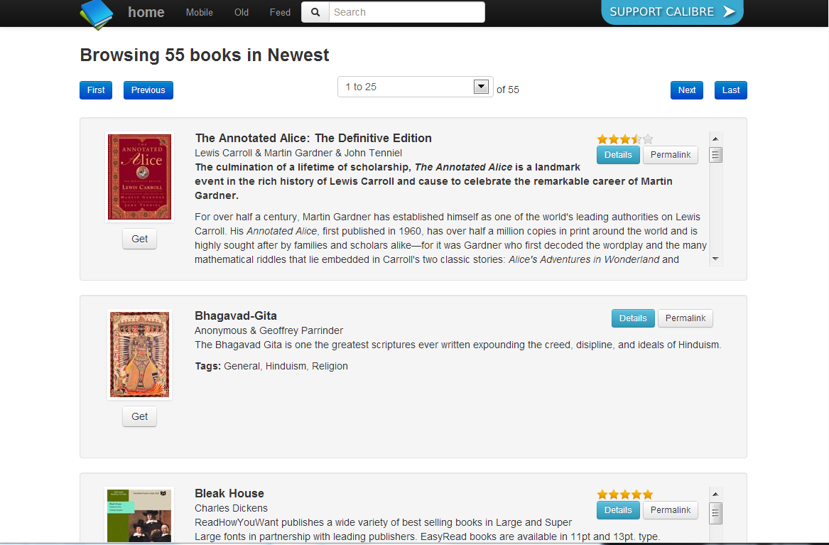
Original version
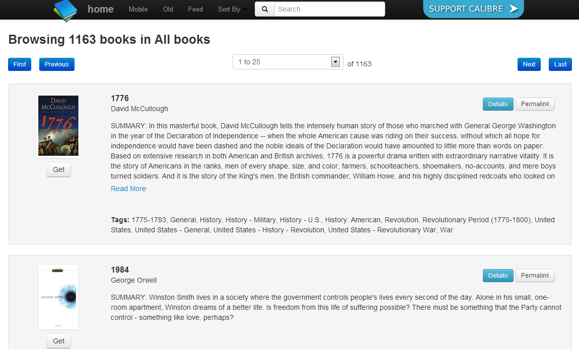
With my updates
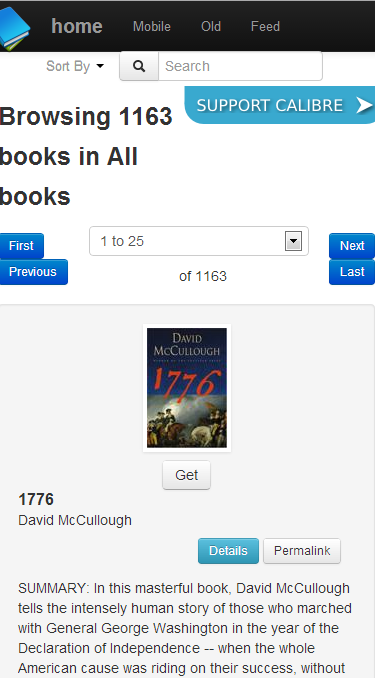
“Mobile” layout
If you are a Calibre user and you’d like to use this (or the original which can be downloaded from the link) you can download the 7zip here: content_server.
To “install”, just unzip and replace the folder. On a windows PC the path is [install_path]\resources\. The folder is content_server.
UPDATE: Craig finished his initial pass at using Bootstrap 3 on put it up on GitHub. It looks great!